Contrast is the foundation of legibility. A letterform can be beautifully drawn, generously spaced, and set at a comfortable size, and still fail if it does not separate cleanly from its background. In 2005 we could say little more than "dark text on a light ground, and plenty of difference between them." Today contrast is measurable, testable, and written into law in many jurisdictions — and the measurement itself has become a subject of serious research.
The WCAG 2.x Contrast Model
The Web Content Accessibility Guidelines 2.x define contrast as a ratio of the relative luminance of two colors, running from 1:1 (identical) to 21:1 (pure black on pure white). Three success criteria apply it:
- 1.4.3 Contrast (Minimum), Level AA — body text must reach 4.5:1; large text (roughly 24 pixels, or 19 pixels bold) may drop to 3:1.
- 1.4.6 Contrast (Enhanced), Level AAA — 7:1 for body text, 4.5:1 for large text, intended for readers with moderately low vision.
- 1.4.11 Non-text Contrast, Level AA — 3:1 for interface components and meaningful graphics: input borders, focus indicators, icons, chart elements.
Where the Math Falls Short
The WCAG 2.x formula is a physical measure, not a perceptual one, and its limitations are now well documented by the working group itself. The ratio treats polarity as symmetric: it scores white-on-black identically to black-on-white, though the eye does not experience them identically. It handles font weight and size only through a single crude "large text" threshold, though a thin light typeface at 16 pixels and a bold one at the same ratio read very differently. And near the dark end of the range, the formula can pass color pairs that human observers judge as weak, while failing pairs that read acceptably.
The APCA Research Direction
The draft work toward WCAG 3.0 includes a candidate replacement, the Accessible Perceptual Contrast Algorithm (APCA), developed through the W3C's visual contrast research. It differs from the 2.x model in three important ways: it is perceptually based rather than purely luminance-based; it is polarity-aware, scoring light-on-dark and dark-on-light differently; and its thresholds scale with font size and weight, so a delicate hairline face is held to a stricter standard than a sturdy text face.
APCA remains a draft direction, not a conformance standard. For now the practical position is: conform to WCAG 2.x, and use the APCA way of thinking — weight and size matter, polarity matters — as design judgment layered on top.
More Contrast Is Not Always Better
It is tempting to treat contrast as a dial to turn all the way up. For many readers with low vision, maximum contrast genuinely helps. But for a meaningful minority it hurts. Very high contrast — especially pure white text on pure black — produces halation, a glow or blur around letterforms, particularly for readers with astigmatism or light sensitivity. Some readers with dyslexia or visual stress report that stark black-on-white feels harsh and prefer a slightly softened ground, such as near-black text on an off-white surface.
The lesson is not to lower contrast below the minimums. It is that contrast requirements define a floor, and good typography works in the range above that floor without racing to the ceiling. A near-black like a very dark gray on a warm off-white passes AAA comfortably and reads more calmly than #000 on #FFF. Better still, systems can let readers choose: the prefers-contrast media query reports when a user has asked their operating system for more (or less) contrast, and a stylesheet can respond by strengthening text color, thickening borders, and removing decorative translucency. On Windows, forced-colors mode goes further and substitutes the user's own palette; designs should tolerate it rather than fight it.
Never Encode Meaning in Hue Alone
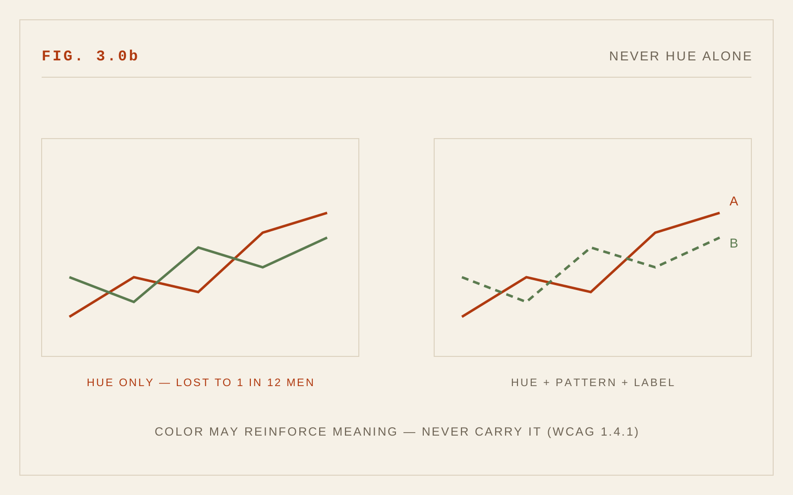
Roughly one in twelve men and a much smaller share of women have some form of color vision deficiency, most commonly in distinguishing reds from greens. WCAG 1.4.1 (Use of Color) exists for them: color may reinforce meaning but must never carry it alone. A link distinguished from body text only by hue is invisible to many readers — pair it with an underline. An error state shown only by a red border needs an icon or message as well. A chart whose series differ only in hue needs labels, patterns, or direct annotation.
This is an old print principle wearing new clothes. Twentieth-century information designers knew that a map legible in photocopy was a stronger map. Design as if your page might be seen in grayscale, because for some readers it effectively is.
Why This Chapter Is New
When the first edition of these guidelines was written, WCAG 2.0 had not yet been published; there was no numeric contrast requirement to cite, no browser tooling to test one, and no media query through which a reader could express a contrast preference. The intervening two decades produced the 4.5:1 standard, its legal adoption, a body of criticism of its formula, and a perceptual successor now taking shape in the WCAG 3.0 draft. Contrast moved from taste to measurement — and then, usefully, to a debate about what the measurement should be.
In CSS
:root {
  --ink: #1f1a13;
  --paper: #f6f1e7;   /* ≥ 4.5:1 against ink (WCAG 1.4.3) */
  --accent: #b03a10;  /* check at the size and weight it's used */
}

@media (prefers-contrast: more) {
  :root { --ink: #000; --paper: #fff; }
}
Recommendations
- Meet WCAG 1.4.3 (4.5:1 for body text) as an absolute floor; aim for 1.4.6 (7:1) where the audience skews older or low-vision.
- Apply 1.4.11: focus indicators, input borders, and meaningful icons need 3:1 against their surroundings.
- Judge thin and light typefaces more strictly than the ratio alone suggests; weight and size change effective contrast.
- Avoid pure black on pure white for long-form reading; a very dark gray on a soft off-white reduces halation without sacrificing conformance.
- Never let hue carry meaning alone — underline links, label states, annotate charts.
- Support
prefers-contrastand tolerate forced-colors mode rather than overriding it. - Track the APCA work in the WCAG 3.0 draft, but conform to 2.x today.