A typographic hierarchy tells the reader what a page is about, how it is organized, and where to enter it — before a single sentence is read. The 2005 edition recommended sizing hierarchy levels by a consistent ratio between 1.2 and 1.5, and warned that a poorly chosen base size would break down under scaling. Both points survive, but each has grown a second dimension the original could not address: scales are now fluid rather than fixed, and hierarchy on the web is no longer only visual. It must also be structural, because a substantial share of readers never see it.
What Changed Since 2005
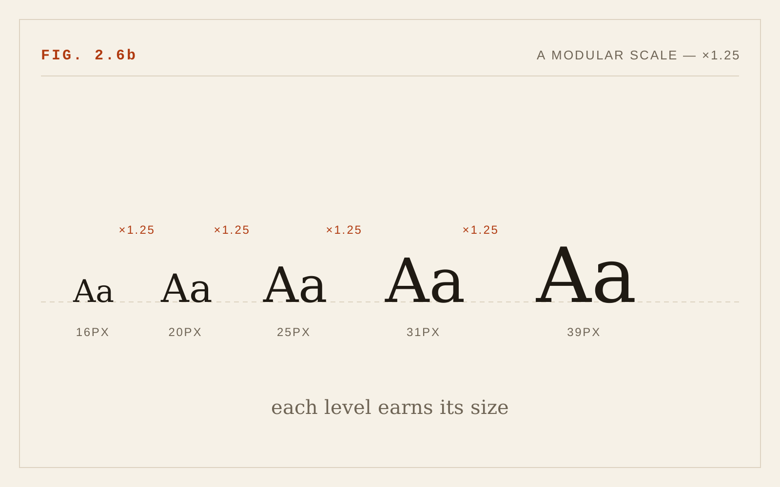
The 1.2–1.5 ratio recommendation matured into the now-standard practice of modular type scales: every size on the page derived by repeatedly multiplying a base size by one ratio. Common ratios have acquired names from musical intervals — 1.2 (minor third), 1.25 (major third), 1.333 (perfect fourth), 1.5 (perfect fifth) — and the original range remains exactly right, with a refinement: the ratio should suit the medium. Dense product interfaces and long-form reading do well with gentle ratios (1.125–1.25), which yield enough distinct sizes without huge headlines; editorial and marketing pages can carry 1.333 or 1.5. A ratio that generates a 60-pixel h2 in a data-heavy application is the wrong ratio for that context.
The larger technical change is that a scale no longer needs to be one fixed set of numbers. CSS clamp() lets each step of the scale be fluid: a size defined with a minimum, a viewport-relative preferred value, and a maximum, so headings scale smoothly between phone and desktop instead of jumping at breakpoints. A well-built fluid scale effectively uses a smaller ratio on small screens and a larger one on large screens — which matches how print designers always adjusted display type to the page. One accessibility caution is essential: the viewport-relative middle term must be mixed with a rem-based component (for example, a calculation combining rem and vw), never pure viewport units. Text sized only in vw ignores the user's font-size preference and does not respond to browser text resizing, undermining WCAG's resize and reflow requirements. Every clamp() expression should still honor a user who has set their base size to 200%.
The original's warnings about scaling behavior — truncated frames, vanishing button labels, broken reading order at 150% — have been codified. WCAG requires text to resize to 200% without loss (1.4.4 Resize Text) and content to reflow at 320 CSS pixels (1.4.10). The old advice to "design for scaling" is now simply conformance.
Hierarchy Must Be Structural, Not Just Visual
The most important addition to this chapter is invisible. A screen-reader user does not perceive that a line is 32 pixels and bold; they perceive that it is — or is not — a heading element at a particular level. Screen-reader users routinely navigate by pulling up a list of headings and jumping between them; a page whose "headings" are merely enlarged bold paragraphs offers them no structure at all. This is what WCAG's Success Criterion 1.3.1 Info and Relationships (Level A) requires: information conveyed through visual presentation — including hierarchy — must also be programmatically determinable.
The practical discipline has two halves. First, every visual heading must be a real heading element (h1 through h6), and heading levels must reflect the document's outline: one h1 for the page's subject, h2 for major sections, h3 for their subsections, without skipping levels on the way down. Second — and this is where designers most often go wrong — the semantic level and the visual size must be decoupled. The correct heading level is dictated by the document structure; the correct size is dictated by the design. When they conflict (an h2 that should look modest, an h4 that deserves prominence), keep the structural level and restyle it with a class. Choosing the tag for its default size is the root cause of most broken outlines on the web.
Hierarchy Beyond Size
The 2005 chapter treated hierarchy as a sizing problem. Mature practice distributes the work across four variables — size, weight, space, and color — and size is often the least efficient of them. A step up in font weight (say, 400 to 600) or a band of white space above a heading can signal a new section as clearly as a size jump, without consuming vertical space or crowding small screens. This matters for accessibility as well as economy: hierarchies that lean entirely on size tend to collapse at narrow viewports, where display sizes must shrink, while weight- and space-based differentiation survives any viewport. Variable fonts make weight a continuous axis, so intermediate weights can be tuned precisely to the contrast a level needs. Color and secondary cues should never carry hierarchy alone — they must ride on top of structural markup and at least one other visual signal, and heading text still needs to meet contrast requirements.
Two smaller modern refinements. Multi-line headings benefit from text-wrap: balance, which equalizes line lengths so a headline does not strand a single word on its last line — a small CSS declaration that replaces years of manual break tweaking. And heading line-height should be set tight (roughly 1.1–1.25, per the earlier chapter) at each level of the scale rather than inherited from body text.
The base size, as the original insisted, remains paramount: the whole scale multiplies from it. The modern floor is the browser default of 1rem (16px by default) for body text — set in rem, never pixels, so user preferences propagate — with long-form reading often served better at 1.125–1.25rem.
In CSS
:root {
  /* a fluid modular scale, ratio ≈ 1.25, anchored in rem */
  --step-0: 1rem;
  --step-1: clamp(1.25rem, 1.15rem + 0.5vw, 1.5rem);
  --step-2: clamp(1.55rem, 1.35rem + 1vw, 2.2rem);
  --step-3: clamp(1.95rem, 1.55rem + 2vw, 3.2rem);
}
h1 { font-size: var(--step-3); text-wrap: balance; }
h2 { font-size: var(--step-2); text-wrap: balance; }
h3 { font-size: var(--step-1); }
Recommendations
- Build sizes from a modular scale with a ratio of roughly 1.2–1.5, chosen for the density of the content.
- Make the scale fluid with clamp(), always mixing a rem component into the preferred value so user font-size settings are honored.
- Use real heading elements in a logical outline — one h1, no skipped levels — per WCAG 1.3.1; never choose a tag for its size.
- Decouple semantics from appearance: style heading levels with classes when structure and design disagree.
- Express hierarchy through weight and space as well as size; avoid hierarchies that depend on size or color alone.
- Set body text at a minimum of 1rem in relative units, and verify the hierarchy survives 200% text resize and 320px reflow.
- Apply text-wrap: balance and tightened line-height to headings.