For most of the history of screen typography there was one reading surface: dark text on a light ground, imitating paper. Dark mode changed that. Within a few years it went from a niche developer preference to a system-level setting on every major operating system, and readers now arrive at a page having already told their device which polarity they want. Typography has to answer on both surfaces.
What the Polarity Research Says
Display polarity — whether text is dark-on-light (positive polarity) or light-on-dark (negative polarity) — has been studied since the CRT era, and the findings have been fairly consistent. For sustained reading in ordinary lighting, positive polarity generally measures better: studies of proofreading, visual acuity, and reading speed tend to favor dark text on a light background. The leading explanation is physiological. A bright surface constricts the pupil, and a smaller pupil produces a sharper retinal image with greater depth of field. Light-on-dark text dilates the pupil and softens the image.
That is the general case, not the universal one. Dark mode earns its place in at least three situations:
- Low ambient light. A bright white page in a dark room is glaring, disrupts dark adaptation, and can be genuinely uncomfortable. In dim environments, negative polarity reduces the mismatch between screen and surroundings.
- Photophobia and light sensitivity. Readers with migraine-related light sensitivity, certain post-concussion symptoms, or conditions that make bright fields painful often depend on dark themes to read at all.
- Some low-vision conditions. Readers affected by light scatter — from cataracts or clouded media, for example — may see more clearly when the total light emitted by the page is reduced. Screen magnifier and high-contrast users have long included a light-on-dark contingent for exactly this reason.
Halation and the Astigmatism Problem
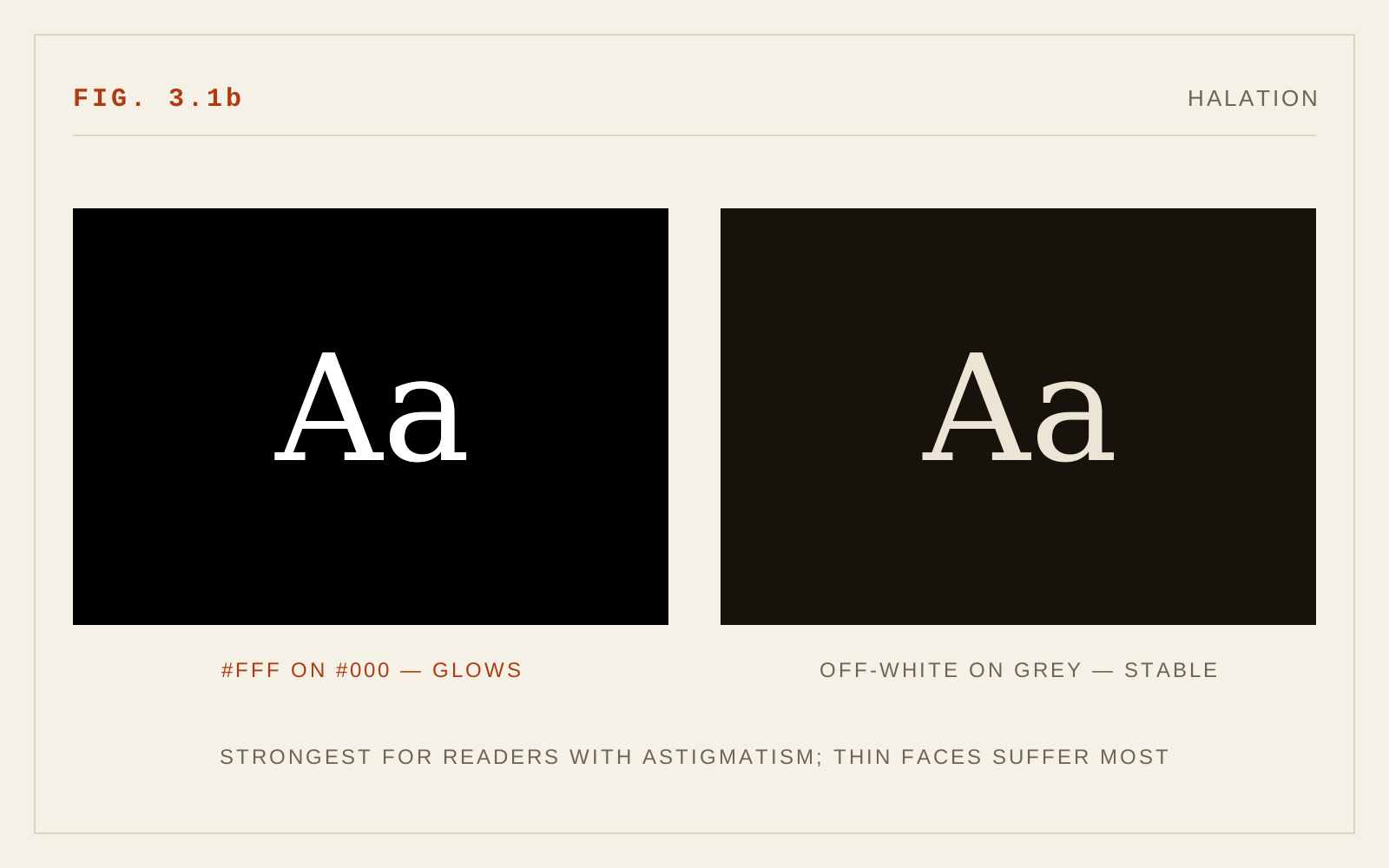
The characteristic failure of dark themes is halation: bright text on a dark ground appears to glow, bleeding outward and blurring the letterform. The effect is strongest with pure white on pure black, and it is worst for readers with astigmatism — a very common refractive condition — whose imperfectly focused optics smear the bright strokes further. Thin typefaces suffer most, because the halo consumes a larger share of the stroke.
The remedies are straightforward:
- Never use pure white text on pure black. Soften both ends: a light gray on a very dark gray dramatically reduces glow while keeping ample contrast.
- Compensate for apparent weight. Light text on a dark ground looks bolder than the same type reversed, because the bright strokes spread. Type set in a dark theme can often stand to be a touch lighter in weight — or, with a variable font, adjusted by grade (see the following chapter) so the correction causes no reflow.
- Do not simply invert the light palette. A dark theme designed by negation usually has too much contrast in the text and too little in the interface. It should be designed as its own composition, with its own tested contrast values.
Respecting the Reader's Choice
The prefers-color-scheme media query reports the reader's operating-system preference, and honoring it is the modern baseline. A reader who has chosen dark mode at the system level has expressed a preference — sometimes a medical need — and a site that blasts them with a white page has overruled it. The inverse holds too: forcing a dark theme on readers who chose light is equally presumptuous. Offer an in-page override if you like, but default to the OS setting, and remember to define both themes fully: a half-styled dark mode, with dark text inherited onto a dark surface, is worse than none.
The Hardware Beneath the Page
The display itself is part of the reading surface. On OLED screens, black pixels are simply off, which means true-black themes save battery — a legitimate benefit — but per-pixel switching can produce faint smearing of light text during scrolling on some panels, another argument for near-black rather than absolute black. E-ink displays sit at the other extreme: they are reflective, like paper, do not emit light, and render positive polarity almost exclusively well. Content likely to be read on e-readers should never depend on a dark theme for its legibility.
Why This Chapter Is New
In 2005, dark screens belonged to terminals and science fiction; the web was white, and polarity was a settled question because readers had no way to express a preference. There was no system-wide dark setting, no prefers-color-scheme, no OLED in a reader's pocket. Dark mode as a mainstream, user-controlled reading surface is a development of the last decade, and it turned polarity from a historical footnote into a live design responsibility.
In CSS
/* Design the dark theme; don't just invert the light one */
@media (prefers-color-scheme: dark) {
  :root {
    --paper: #171310;   /* near-black — never #000 */
    --ink: #ece5d6;     /* off-white — never #fff (halation) */
  }
  img { filter: brightness(0.9); }  /* dim plates to the surface */
}
Recommendations
- Keep dark-on-light as the default surface for long-form reading; the sustained-reading evidence favors it.
- Honor
prefers-color-schemein both directions — treat the OS setting as the reader's decision. - In dark themes, avoid pure white on pure black; soften both values to control halation.
- Reduce type weight slightly (or lower the grade) in dark themes to counter apparent bolding.
- Design the dark palette independently and verify its contrast ratios; do not invert the light theme.
- Prefer near-black surfaces over absolute black on OLED to limit scroll smearing, unless battery savings is the explicit goal.
- Assume e-ink readers see positive polarity; never make dark mode load-bearing.