For the first two decades of web typography, a typeface was a set of frozen instances: regular, italic, bold, perhaps a light and a black if the budget allowed. Every choice between them was a choice among fixed points. Variable fonts — introduced with OpenType Font Variations in 2016 and now supported across all major browsers — replace those points with continuous ranges. One file contains an entire design space, and the typographer, the stylesheet, or the reader can select any position within it.
This matters to accessibility because so many of the adjustments this publication has recommended — a touch more weight at small sizes, a slightly wider set for low-vision readers, sturdier forms in adverse conditions — were previously impossible unless the foundry had happened to cut that exact instance. Now they are numbers.
The Axes
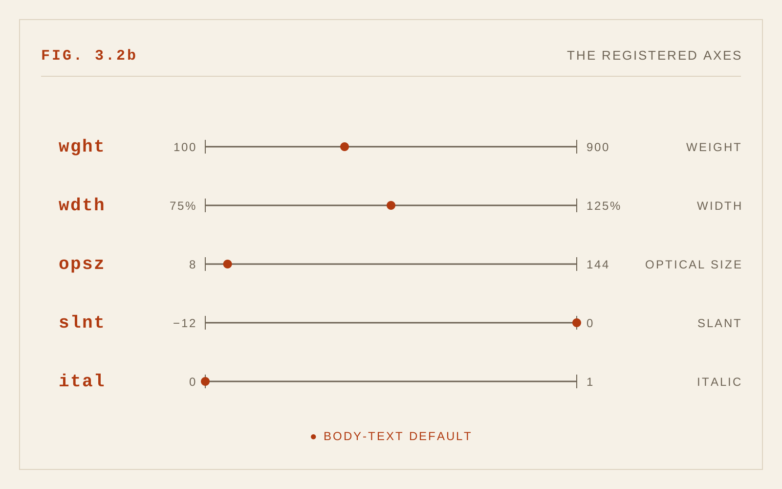
A variable font exposes named axes of variation. Five are registered in the OpenType specification:
- wght (weight) — continuous from hairline to black, rather than steps of a hundred.
- wdth (width) — condensed through extended, without the distortion of mechanical scaling.
- opsz (optical size) — forms adapted to the size at which they will be read.
- slnt (slant) and ital (italic) — oblique angle and the switch to true italic forms.
font-weight, font-stretch, font-style, and font-optical-sizing — which should be preferred over the low-level font-variation-settings so that styles cascade and combine predictably.
Optical Sizing: An Old Tool Returns
Optical sizing is not new; it is very old, and its absence from digital type was the anomaly. In metal type, each size was cut separately, and the punchcutter compensated: small sizes got sturdier strokes, wider spacing, larger x-heights, more open counters; display sizes got finer contrast and tighter fit. Phototypesetting and then digital fonts abandoned this, scaling one master to every size — which is why so much small digital text has felt thin and clogged.
The opsz axis restores the practice. A well-made variable font with an optical size axis renders caption-size text with robust, open forms and headline text with refinement, automatically, when font-optical-sizing: auto is in effect (the default). For low-vision readers, who live at the small-and-strained end of the range, this is a direct legibility gain that costs the designer nothing but choosing a font that supports it.
Grades: Weight Without Reflow
A grade axis changes the darkness of the strokes without changing the width of the glyphs. That distinction is the whole point: adjusting font-weight alters letter widths and therefore reflows the text, while adjusting grade does not. Text can get visually heavier or lighter and every line break stays put.
The previous chapter noted that light text on dark surfaces appears bolder than the same type on white. Grade is the precise instrument for that correction: drop the grade slightly in dark mode and the two themes match in apparent weight, with no layout shift when a reader toggles between them. Grades are equally useful for hover and selected states, and for compensating across displays that render type heavier or lighter than intended.
Performance Is Accessibility
A family that once required six or eight font files can ship as one or two (roman and italic). Even though a variable file is larger than any single static instance, it is almost always smaller than the sum of the instances it replaces, and it costs fewer network requests. For readers on slow connections and modest devices — a population that overlaps heavily with the readers accessibility work serves — this means less time staring at invisible or fallback text and fewer jarring swaps when the web font finally arrives. Subsetting and modern compression formats reduce the cost further.
There is also a design benefit with an accessibility dividend: when every weight is available, designers stop pressing faux-bold and faux-italic into service, and stop choosing a too-light weight merely because it was the only file loaded.
Personalization: The Larger Promise
The deepest opportunity is still mostly unrealized: letting the reader tune the type. A reading application or long-form site built on a variable font can offer a weight slider, a width adjustment, a spacing control — continuous, immediate, and reversible. A reader with low vision who finds the default weight thin can thicken it to taste rather than choosing between "normal" and "bold." An older reader can widen the forms slightly. These are exactly the adjustments low-vision research has long suggested help, and variable fonts make them cheap to offer.
Few sites do this yet, and no standard interface exists for it. But the technical barrier has fallen, and this publication's position is that reader-tunable type is where screen typography should be heading: the designer sets a well-judged default, and the reader may depart from it.
Why This Chapter Is New
When the first edition appeared, web pages could not reliably embed fonts at all — typography meant choosing among the handful of faces installed on the reader's machine. Web font embedding arrived around 2010; variable fonts were specified in 2016 and reached broad browser support in the years following. The idea that a stylesheet could specify weight as 435, or that optical sizing could return from the metal era through an axis in a file, simply did not exist to be written about.
In CSS
body {
  font-optical-sizing: auto;   /* opsz: text forms at text sizes */
}

@media (prefers-color-scheme: dark) {
  /* grade trims dark-mode weight bloom without reflow */
  body { font-variation-settings: "GRAD" -20; }
}
Recommendations
- Prefer variable fonts for new projects; ship one roman and one italic file rather than a stack of statics.
- Choose faces with an optical size axis for interfaces that set text at many sizes, and leave
font-optical-sizing: autoin effect. - Use the grade axis (where available) to correct apparent weight in dark mode without causing reflow.
- Use high-level CSS properties (
font-weight,font-stretch) rather than rawfont-variation-settingswhere possible. - Never rely on faux-bold or faux-italic; the variable file makes the real forms available.
- Where long-form reading is the product, consider offering readers direct control of weight and width — and remember their choice.