The first edition of these guidelines assumed a screen: singular, deskbound, of predictable size. That assumption is gone. The same paragraph must now read well on a phone held at arm's length, a tablet, a laptop, and a wall-sized display — and, more importantly, it must read well for a person who has enlarged their system font, zoomed the page to 400 percent, or both. Fluid typography is the craft of scaling type across this range; accessible fluid typography is doing so without silently overruling the reader.
Fluid Scales and the clamp() Function
The modern idiom sets font size with the CSS clamp() function: a minimum, a preferred value that grows with the viewport, and a maximum. Instead of jumping between fixed sizes at breakpoints, the type glides — headings that are grand on a desktop ease down gracefully on a phone, and the awkward in-between widths that breakpoints never quite served are handled automatically.
Used well, this is a genuine gain for readability. Used carelessly, it creates a new class of accessibility failure, and the failure is subtle enough to survive casual testing.
The Accessibility Caveat
Everything in this publication rests on one contract: the reader's size settings win. Browsers let users set a default font size; operating systems offer text scaling; WCAG 1.4.4 (Resize Text) requires that text can be resized up to 200 percent without loss of content or function. Fluid formulas can quietly break this contract in two ways.
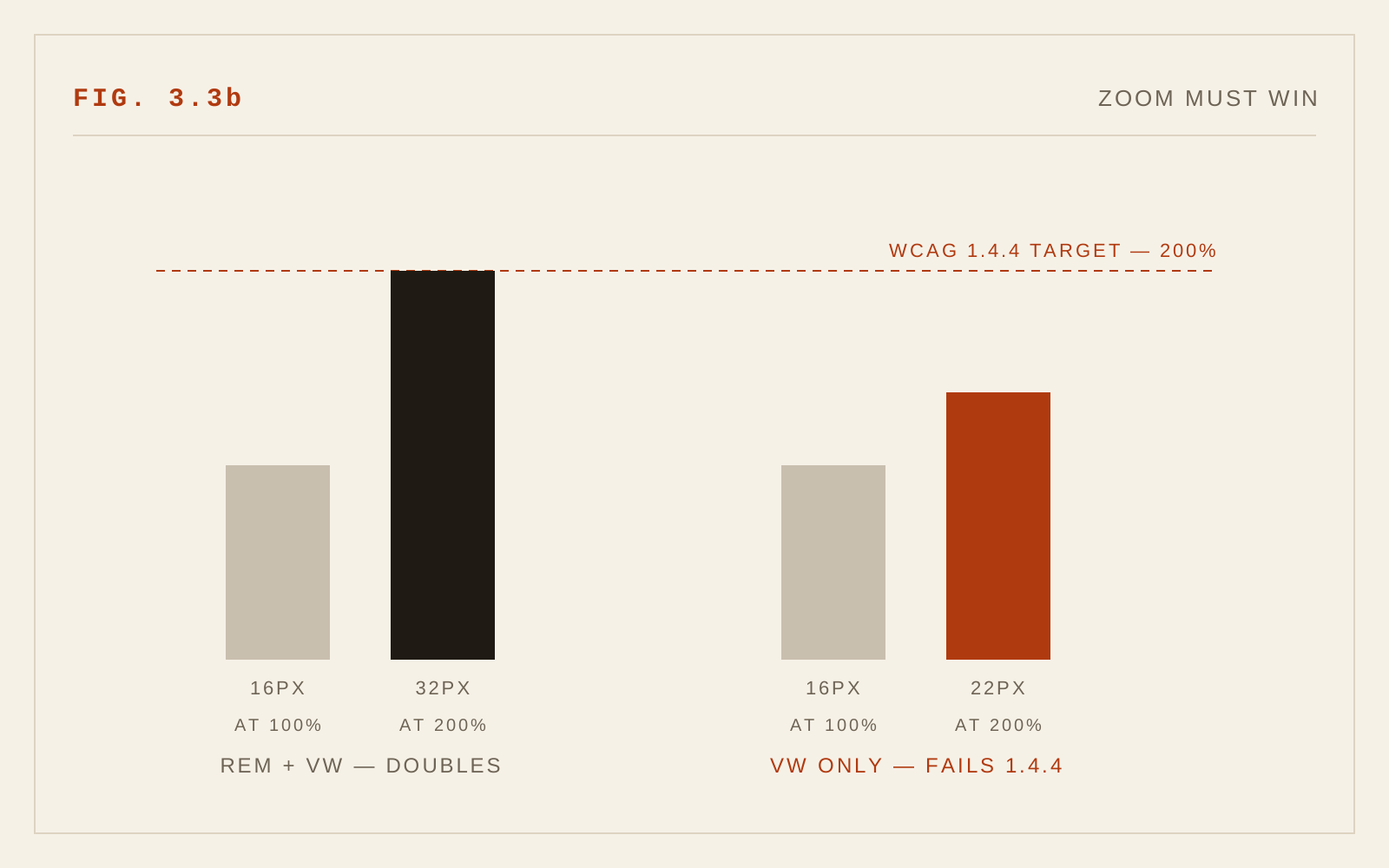
First, a formula built purely on viewport units — say, a size derived only from vw — does not respond to the user's font-size preference at all. The page looks fluid and modern, and a reader who has set their browser to a larger default sees no effect whatsoever. The remedy is to build formulas on rem: keep the minimum and maximum in rem, and give the preferred value a rem-based component alongside its viewport term. Then the whole scale rides on top of the user's setting, as it should.
Second, the clamp itself can fight zoom. When a reader zooms, viewport units shrink in CSS terms, so a vw-heavy formula partially cancels the zoom: the reader magnifies the page and the text enlarges by less than the zoom factor, and in extreme cases cannot reach the 200 percent that WCAG 1.4.4 requires. Any fluid scale must be tested at high zoom — not assumed.
Reflow and 400 Percent Zoom
WCAG 1.4.10 (Reflow) requires that content work at a width of 320 CSS pixels — equivalent to a 1280-pixel window zoomed to 400 percent — without horizontal scrolling for reading. Many low-vision readers live at these magnifications. Fluid type helps here when it is honest: at that effective width, the scale should sit at its minimum, line lengths should shorten, and nothing should escape the viewport. Fixed-width containers, absolute positioning of text, and multi-column layouts that refuse to collapse are the usual offenders. Test every reading page at 400 percent; it takes a minute and it is where these failures hide.
Container Queries
Media queries ask how big the window is; container queries ask how big the component's own box is, which is usually the question typography actually needs answered. A card is a card whether it sits in a sidebar or spans the page, and its type can now respond to its own width, using container query units for fluid sizing within the component. The same caveat carries over unchanged: container-relative units know nothing about the reader's font-size preference, so they too must be combined with rem-based terms and tested under zoom.
Smaller Tools, Real Gains
Several recent CSS properties address old typographic problems directly:
- text-wrap: balance evens out the line lengths of short blocks — headings above all — eliminating the two-word orphan line under a long first line. It is intended for a few lines, not body copy.
- text-wrap: pretty lets the browser spend more effort on paragraph line breaking, avoiding lonely last words and improving rag. Support is still uneven across engines; treat it as progressive enhancement.
- font-size-adjust matches the x-height of a fallback font to the web font it stands in for. While the web font loads — or if it never arrives — the fallback renders at an equivalent apparent size, which reduces layout shift and keeps the fallback text as legible as the intended face. Given how much reading happens in the seconds before fonts load, this modest property earns its place.
Why This Chapter Is New
In 2005 there was no fluid typography because there was nothing to be fluid across: the mobile web barely existed, responsive design would not be articulated until 2010, and clamp(), container queries, text-wrap control, and widely supported font-size-adjust are all developments of the past several years. The reflow requirement itself only entered WCAG with version 2.1 in 2018. The multiplicity of screens created the problem; CSS has only recently supplied the instruments; and the accessibility discipline around those instruments is younger still.
In CSS
h1 {
  /* fluid between bounds; the rem term preserves zoom and settings */
  font-size: clamp(2.25rem, 1.4rem + 3.5vw, 4.5rem);
  text-wrap: balance;
}
p { font-size: 1rem; text-wrap: pretty; }

/* Test at 200% and 400% zoom — WCAG 1.4.4 and 1.4.10 */
Recommendations
- Build fluid scales on rem: minimums, maximums, and a rem component in the preferred value, so user font-size preferences propagate.
- Never size text in viewport units alone.
- Test every template at 200 percent zoom, 400 percent zoom, and with the browser's default font size raised — three different tests, all required.
- Verify WCAG 1.4.10: at 320 CSS pixels of width, reading requires no horizontal scrolling.
- Use container queries for component-level type decisions, with the same rem discipline.
- Apply text-wrap: balance to headings; enable text-wrap: pretty for body copy as progressive enhancement.
- Define font-size-adjust (and size-matched fallbacks) so text is legible before and without the web font.