Design Nomenclature / Composition
Contrast
Also called contrast, opposition, compositional contrast
- Composition
- Color
- Type
- 2D & 3D
Difference made structural: two elements set far enough apart on some attribute — size, weight, direction, texture, value — that the difference itself carries information. The working test is decisiveness. Anything close but not equal reads as a mistake rather than a relationship.
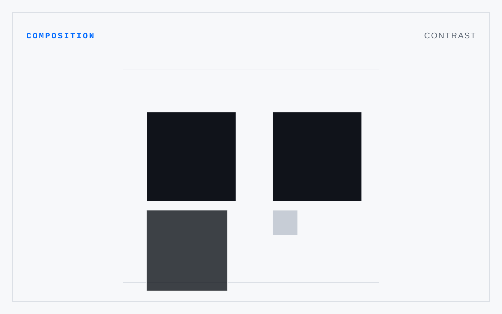
In practice
Colour uses 'contrast' for measurable differences in value, hue, or saturation. Composition uses it for deliberate difference on any attribute at all. Same word, different jobs.
Not to be confused with
- JuxtapositionThe placing of two elements adjacent so that each is read through the other. The meaning arises in the gap rather than in either part — the pairing asserts a relation neither element carries alone. Order and proximity both change what is asserted.
- Contrast of light and darkDifference carried by value. It is the only contrast every viewer receives — colorblind, low-vision, in glare, in greyscale, at a distance — which is why accessibility standards are written in luminance terms and why hue difference alone has never satisfied one.