Design Nomenclature / Type
Didone
Also called modern, modern face
- Type
- 2D
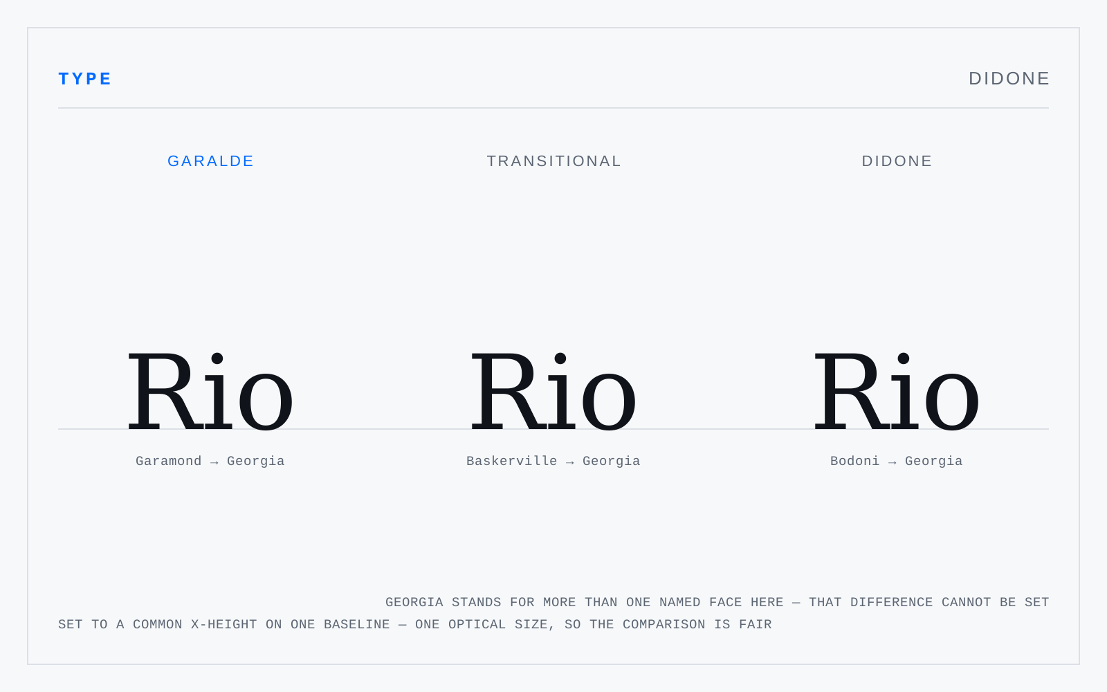
The high-contrast romans of around 1800 — Bodoni, Didot, Walbaum. Exactly vertical stress, abrupt and extreme thick-to-thin, unbracketed hairline serifs meeting the stem at a right angle, ball terminals, tight fitting. Cut for smooth paper and precise presses; on anything coarser, or any low-density screen, the hairlines vanish.
In practice
The evergreen fashion-magazine face, and an evergreen accessibility problem. At text sizes the hairlines drop below the reliable stroke width for low-vision readers. It is a display face.
Not to be confused with
- TransitionalMid-eighteenth-century romans between the garaldes and the didones — Baskerville, Fournier, Bulmer, and the Romain du Roi ahead of them. Stress swings to near-vertical, contrast rises, serifs sharpen and flatten, and the whole design starts to be drawn to a grid rather than derived from a pen.
- Slab serifFaces whose serifs are heavy rectangles roughly the weight of the stems, with contrast near nil. Two branches that behave differently: bracketed Clarendons, which are workable text faces, and unbracketed geometrics like Memphis and Rockwell, which are display faces wearing text clothes.
Origin
Vox's portmanteau of Didot and Bodoni, the two families that define the class.