Design Nomenclature / Type
Hairline
Also called thin stroke
- Type
- 2D
The thinnest stroke in a letter, and the denominator of stroke contrast. Didones drive the ratio past 10:1; humanist faces keep it near 2:1. Hairlines are the part of a face that a rendering pipeline destroys first — they drop out on newsprint, thicken in dark mode, and shimmer on standard-density screens.
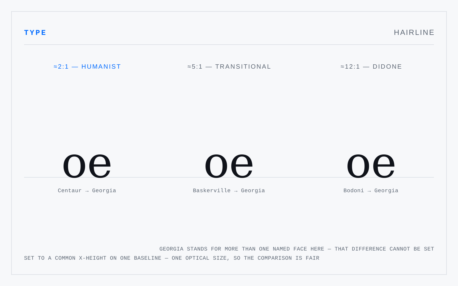
In practice
"Hairline" is also sold as a weight name below Thin, and as a rule width. Same word, three referents; the stroke sense is the one type designers mean.
Not to be confused with
- StemThe principal stroke of a letter — the upright of b, l and H, the main diagonals of A and V. Stem width is the unit a face is built from: weight is stem width relative to the em, contrast is the ratio of stem to hairline, and colour on the page is stem width against the counters between.
- WeightStroke thickness relative to the em — the amount of black a face puts on the page. The CSS scale runs 1–1000 with 400 as regular and 700 as bold; a variable wght axis makes every value between them addressable. Weight names across foundries are not comparable: one foundry's Book is another's Light.