Design Nomenclature / Type
Weight
Also called wght, font-weight
- Type
- 2D
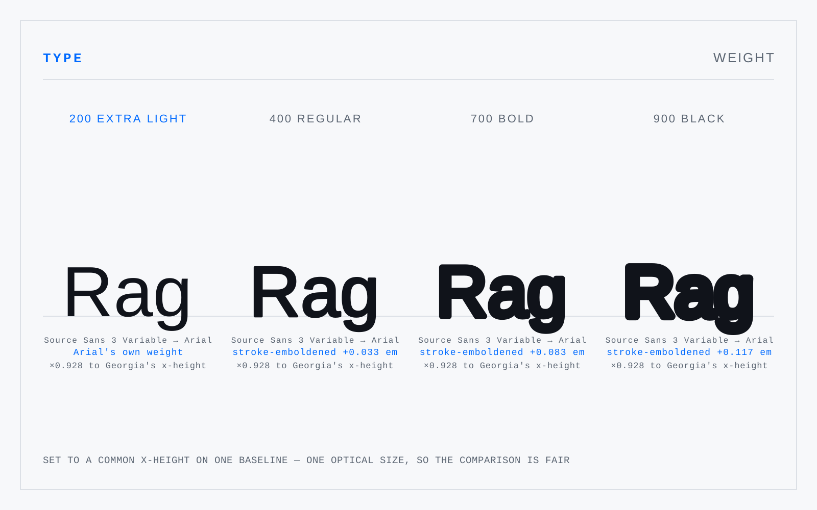
Stroke thickness relative to the em — the amount of black a face puts on the page. The CSS scale runs 1–1000 with 400 as regular and 700 as bold; a variable wght axis makes every value between them addressable. Weight names across foundries are not comparable: one foundry's Book is another's Light.
In practice
Weight compensates for context, not just emphasis. Light text on dark reads heavier than the same weight dark on light, which is why grade axes exist and why dark themes usually want a notch less weight.
Not to be confused with
- WidthHow much horizontal space a face's letters occupy, as a percentage of normal — the wdth axis, exposed in CSS as font-stretch or font-width. A drawn condensed narrows the counters and keeps the stems; horizontal scaling narrows both, which destroys the stress and the weight relationship at once.
- HairlineThe thinnest stroke in a letter, and the denominator of stroke contrast. Didones drive the ratio past 10:1; humanist faces keep it near 2:1. Hairlines are the part of a face that a rendering pipeline destroys first — they drop out on newsprint, thicken in dark mode, and shimmer on standard-density screens.