Design Nomenclature / Systems & Spec
Non-text contrast
Also called SC 1.4.11, UI component contrast, graphical object contrast
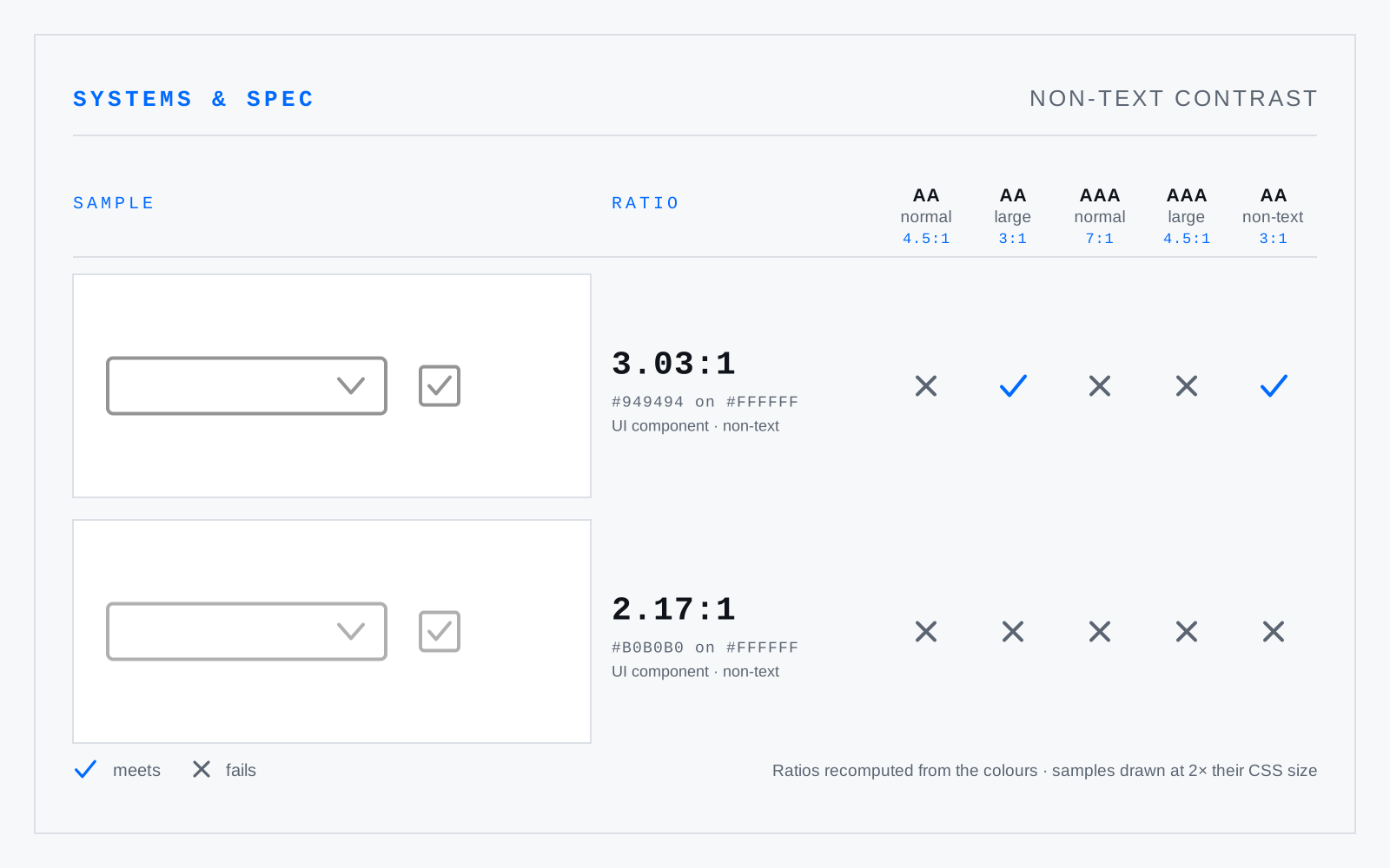
WCAG 2.1 SC 1.4.11, Level AA: user interface components, their states, and the parts of graphics needed to understand content must reach 3:1 against adjacent colour. Input borders, icons, chart keys, focus and selection states — everything a 4.5:1 text audit walks straight past.
In practice
Routinely missed. Pale input borders and grey-on-grey icons satisfy nothing, and “we checked contrast” almost always means text only.
Not to be confused with
- Contrast ratio(L1 + 0.05) / (L2 + 0.05), where L is WCAG relative luminance and L1 is the lighter of the two colours. It runs from 1:1 to 21:1. Hue is discarded entirely — only luminance survives the formula — so two pairs at identical ratios can differ enormously in how readable they look.
- Level AAThe middle WCAG conformance level, and the one policy nearly always specifies. Requires every Level A and Level AA criterion: text contrast 4.5:1, or 3:1 for large text — 18.66px bold or 24px regular; non-text contrast 3:1; reflow to 320 CSS px; and, from 2.2, target size 24×24 CSS px.