Design Nomenclature / Color
Contrast of saturation
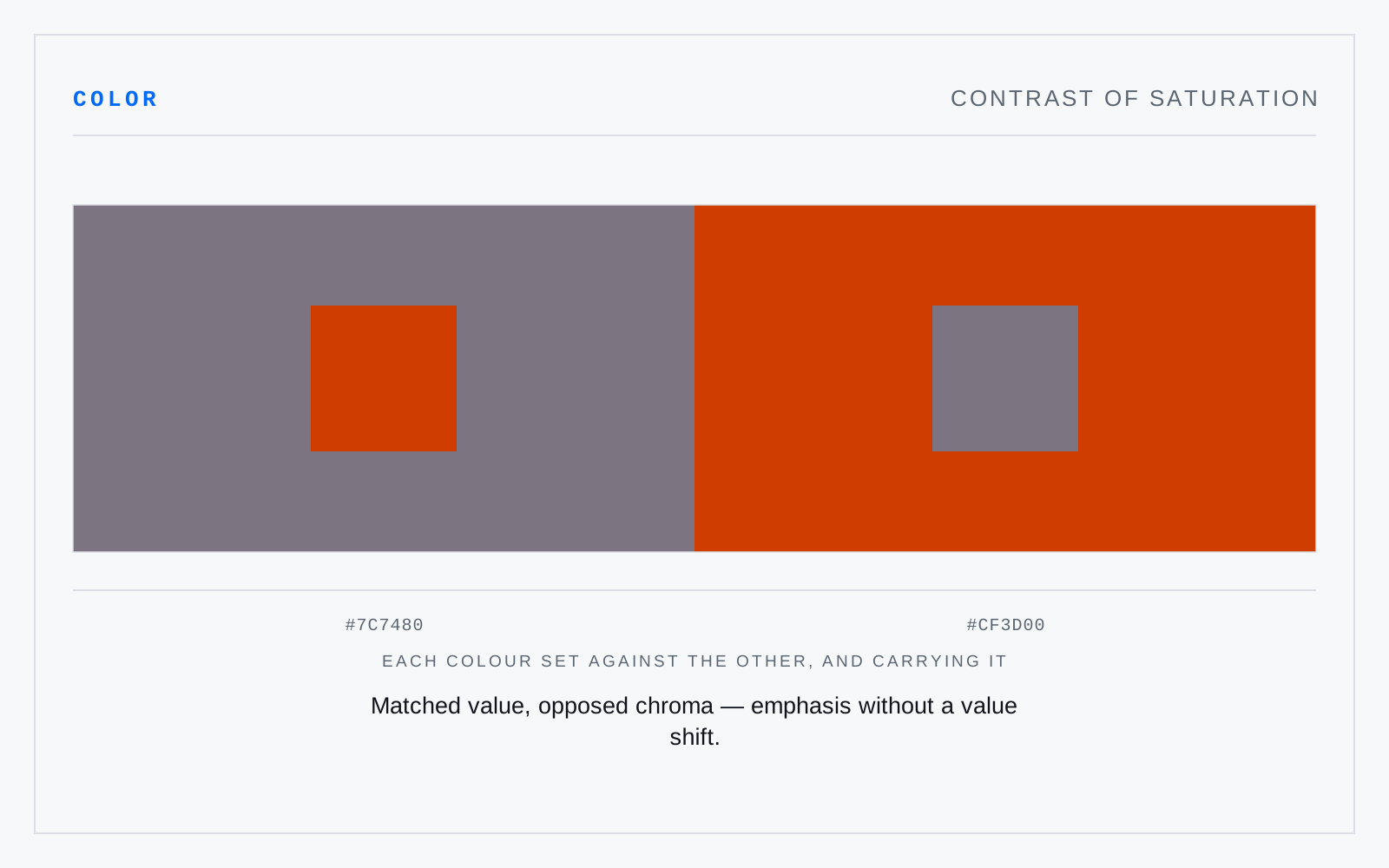
Also called pure-dull contrast, saturation contrast
- Color
- Composition
- 2D & 3D
Difference between a vivid color and a muted one of similar hue and value. The quietest of Itten's contrasts and the most useful in interfaces: a single saturated element in a toned field takes the eye without any change in value, so the page stays calm while still having a subject.
Not to be confused with
- Contrast of light and darkDifference carried by value. It is the only contrast every viewer receives — colorblind, low-vision, in glare, in greyscale, at a distance — which is why accessibility standards are written in luminance terms and why hue difference alone has never satisfied one.
- ChromaThe strength of a color measured against a neutral grey of the same value — how far it sits from the achromatic axis. Chroma is an absolute distance, so its ceiling is not uniform: it varies with hue and with value, which is why a Munsell chroma of 10 is near-maximal for a blue-green and unremarkable for a red.