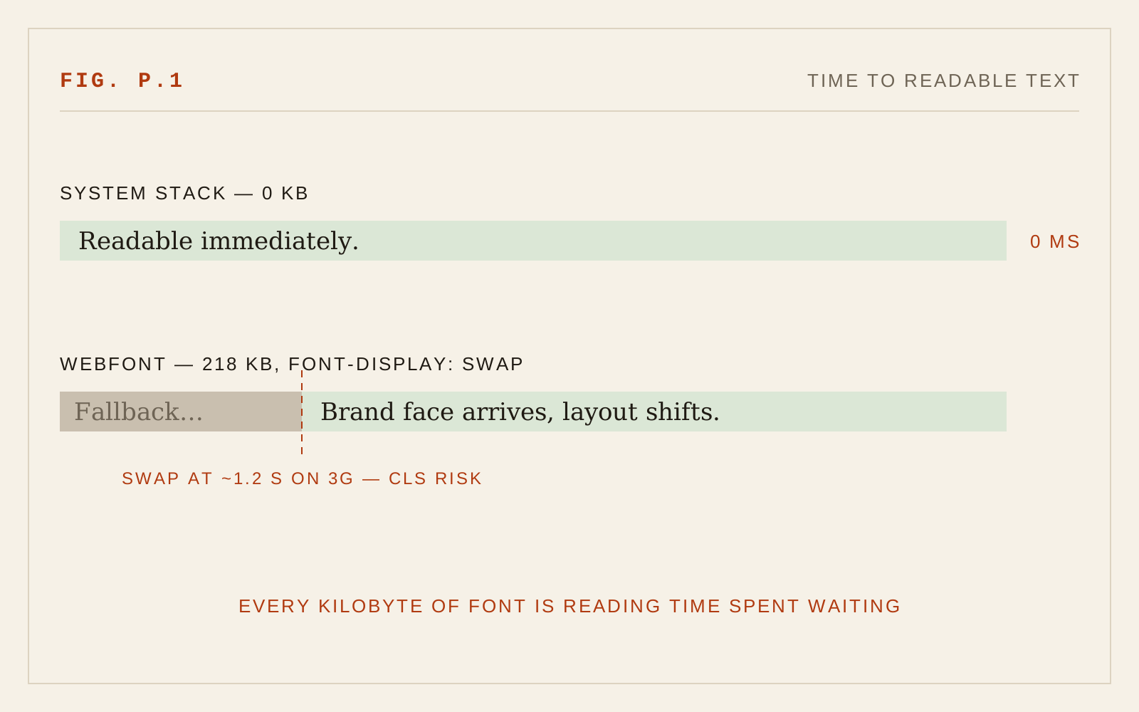
Every conversation about font loading strategy — preloading, subsetting, font-display tuning — is downstream of a decision most teams never consciously make: whether to load fonts at all. For a large class of high-performance applications, the correct typeface selection is the one already installed on the user's machine. Zero kilobytes, zero requests, zero layout shift, readable at the first paint.
What "System Stack" Means Now
The old Arial, sans-serif cop-out is not what I'm describing. A modern system stack is a deliberate composition:
font-family: ui-sans-serif, system-ui, -apple-system,
  "Segoe UI", Roboto, "Helvetica Neue", Arial, sans-serif;
That single declaration buys you San Francisco on Apple devices, Segoe UI on Windows, Roboto on Android — three typefaces that platform vendors have spent, collectively, hundreds of millions of dollars perfecting for their own screens, hinted and rendered by the engines that know them best. Your users read them all day; familiarity is itself a legibility feature, a point the Universal Web chapter on typeface selection makes at length.
The serif and mono stacks deserve the same care: ui-serif/Georgia/Charter for reading surfaces, ui-monospace/SF Mono/Consolas/"Cascadia Code" for code and data. This site's own display face rides on exactly this logic — a commercial face for those who have it, a tuned fallback chain for everyone else.
When Zero Is the Right Number
The decision is about what the interface is. System stacks win when the product is a tool: dashboards, admin panels, trading and monitoring interfaces, developer products, anything used hourly where the typography's job is to disappear. In these applications the font is pure infrastructure — nobody admires the typeface of the thing that pages them at 3am — and the performance budget is better spent on data.
The brand face earns its bytes when the product is a place: marketing surfaces, editorial reading, anywhere the typography carries identity. This portfolio ships webfonts, deliberately; its typography is the content. That's the test — if you deleted the custom face, would the product mean less, or just load faster?
Engineering the Fallback Like It's the Font
The craft of a zero-kilobyte stack is metric discipline. Different platform faces have different x-heights and widths, so a layout tuned only on macOS will breathe differently on Windows. Three tools close the gap:
font-size-adjustnormalizes fallback x-heights so every face in the chain reads at the same effective size.text-wrap: balanceandprettyabsorb the line-break differences between metric-incompatible faces.- Testing on the actual stack — the discipline nobody performs. Screenshot the interface in Segoe, SF, and Roboto; where the design only works in one of them, the design is wrong.