Most typeface advice is written for prose — long lines of lowercase read at leisure. High-performance applications live in a different regime: numbers scanned in columns, identifiers read once at a glance, eleven-pixel labels on screens someone watches for eight hours. A face that's lovely in an essay can be actively dangerous on a trading screen. Here is what to interrogate instead.
Digits First, Letters Second
In a data-dense interface, numerals do most of the work, so audit them before anything else:
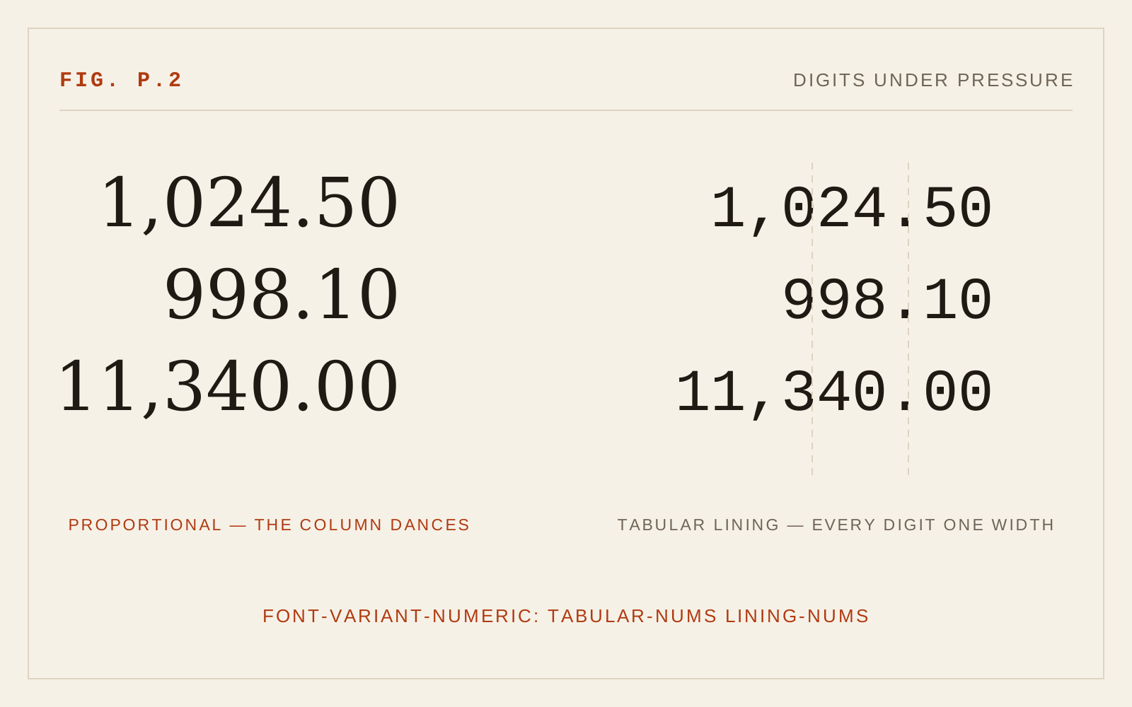
- Tabular figures are non-negotiable. Every digit the same width, so columns hold and a ticking value doesn't jitter its neighbors. The CSS is one line —
font-variant-numeric: tabular-nums lining-nums— but only if the face has the feature. Many fashionable faces don't. - Lining, not old-style. Old-style figures with their ascenders and descenders are beautiful in prose and chaos in a table.
- Weight-stable widths. If the bold digits are wider than the regular ones, every emphasized cell breaks its column. The best interface faces draw all weights on one width — and a variable font's grade axis (weight without width change) is the cleanest solution of all, as the Universal Web variable-fonts chapter covers.
The Interface Alphabet
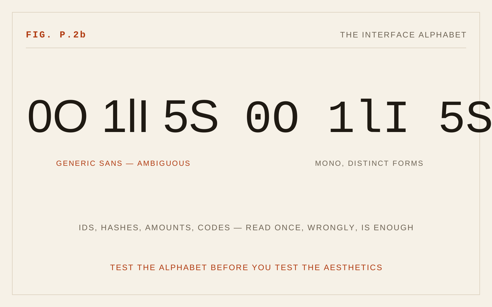
Interfaces are full of strings that must be read correctly exactly once: order IDs, git hashes, API keys, amounts. For those, the confusable set is the whole ballgame — 0/O, 1/l/I, 5/S, 8/B. Test them at production size before you look at a single specimen page. The faces that pass tend to advertise it: slashed or dotted zeros, tailed ells, opened apertures. This is the same anatomy-of-legibility argument the Universal Web makes for low-vision readers — an interface at 11px puts every user in a low-acuity condition.
The Checklist
What I actually run a candidate face through before it ships in an application:
1. Set a real table — live data, tabular-nums on — and watch a value tick. Nothing may move but the digits.
2. The alphabet test: 0O 1lI 5S 8B rn/m at the smallest production size, on both themes.
3. X-height at 11–13px. Faces with small x-heights fall apart exactly where interfaces live. Generous x-height buys effective size for free.
4. Dark-theme weight. Light-on-dark reads a half-weight bolder; if the face has no grade axis or lighter cut to compensate, every label goes soft. (The dark-mode chapter explains the physics.)
5. The feature grep: tnum, lnum, zero, case — check the OpenType features actually present, not the ones the marketing page implies.
6. Performance weight class. All of this must arrive in one or two WOFF2 files small enough not to blockade the data it labels — the subject of the next essay.
The pattern in the checklist is the pattern of this whole discipline: in applications, typography is measured by errors prevented per pixel, not by beauty per specimen. Choose the face that fails to be noticed ten thousand readings in a row.