Design Nomenclature / Composition
Column
Also called grid column
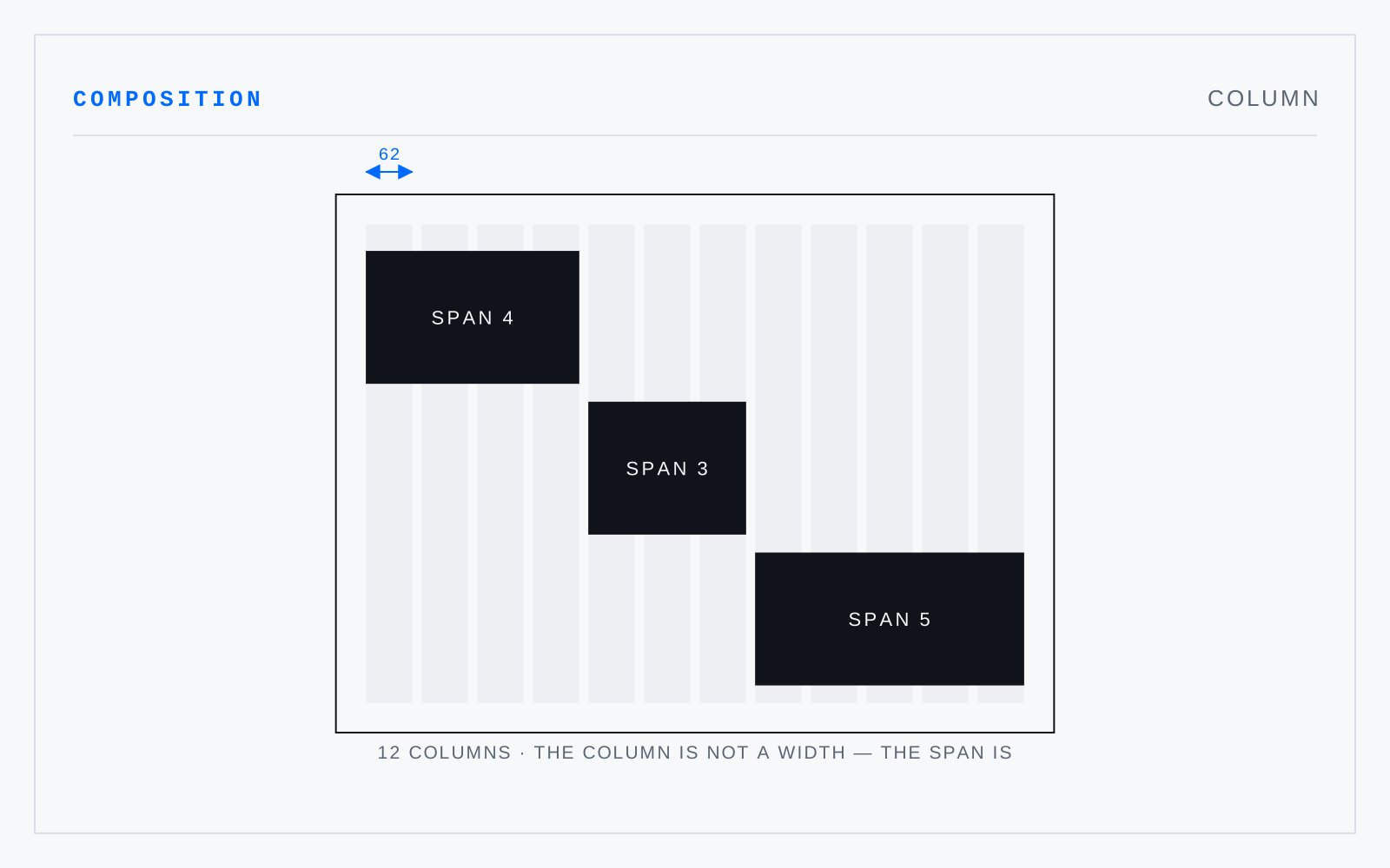
A vertical division of the live area, separated from its neighbours by gutters. Column count governs how many measures a page can offer; column width is what a reader actually experiences. Columns exist to be spanned — the useful grid is the one whose columns combine into more than one usable width.
In practice
A grid column is a structural division; a CSS grid column is a track. They collide in conversation constantly and rarely map one-to-one.
Not to be confused with
- ModuleOne unit of a grid divided on both axes — a rectangle bounded by gutters, occupied alone or combined with its neighbours. Müller-Brockmann's word for the same unit is 'field'. Module size sets the grid's granularity: too fine and it constrains nothing, too coarse and it constrains everything.
- GutterThe space between two columns or two modules. It must be wide enough that the eye does not carry a line across it into the neighbour, and narrow enough that the columns still read as one field rather than two. In bound work the same word names the trench where inner margins meet at the spine.