Design Nomenclature / Color
Complementary
Also called complements, opposite colors, opposite colours
- Color
- Light & Optics
- 2D & 3D
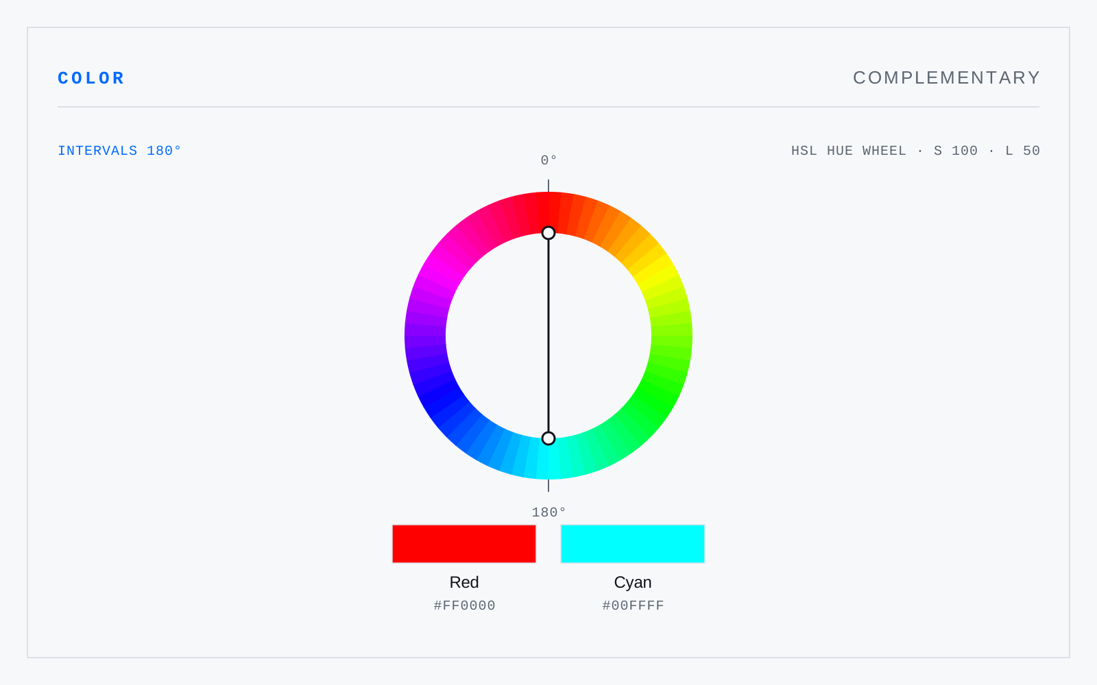
A pair of hues opposite one another on a color wheel — but which pair depends entirely on the wheel. In RYB, blue opposes orange; in additive light, blue opposes yellow; in an opponent space, opposition is the negation of both axes. The schoolroom red-green pairing is a pigment convention, not a fact about light.
In practice
In a brief it almost always means the RYB artist's wheel rather than a physical complement. If the mixing model matters, say which wheel you mean.
Not to be confused with
- Split-complementaryA hue paired with the two hues flanking its complement, roughly 150 and 210 degrees away. It keeps the tension of a complementary pair while removing the vibration of true opposites, which makes it the most forgiving three-hue scheme: hard to make ugly, hard to make memorable.
- TetradicTwo complementary pairs together, arranged as a square at ninety degrees or as a rectangle at unequal intervals. Four hues is more than most compositions can carry, so the scheme needs a firm hierarchy and in practice collapses to one dominant hue, its complement, and two accents.
- Additive colorMixing by summing emitted light: red, green, and blue primaries combine toward white, and every addition raises luminance. Screens, stage lighting, and projection work this way. The primaries were chosen to address the eye's three cone types — there is nothing special about those wavelengths in the physics.
Origin
Latin complēre, 'to fill up'. The pair completes the spectrum — mixed in the right model, the two sum to a neutral.