Design Nomenclature / Type
Kerning
- Type
- 2D
Adjusting the space between one specific pair of glyphs, correcting fits the sidebearings can't get right on their own — AV, To, r. — because the correction depends on the neighbour. Fonts ship kern pairs in the GPOS table; browsers apply them by default at text sizes.
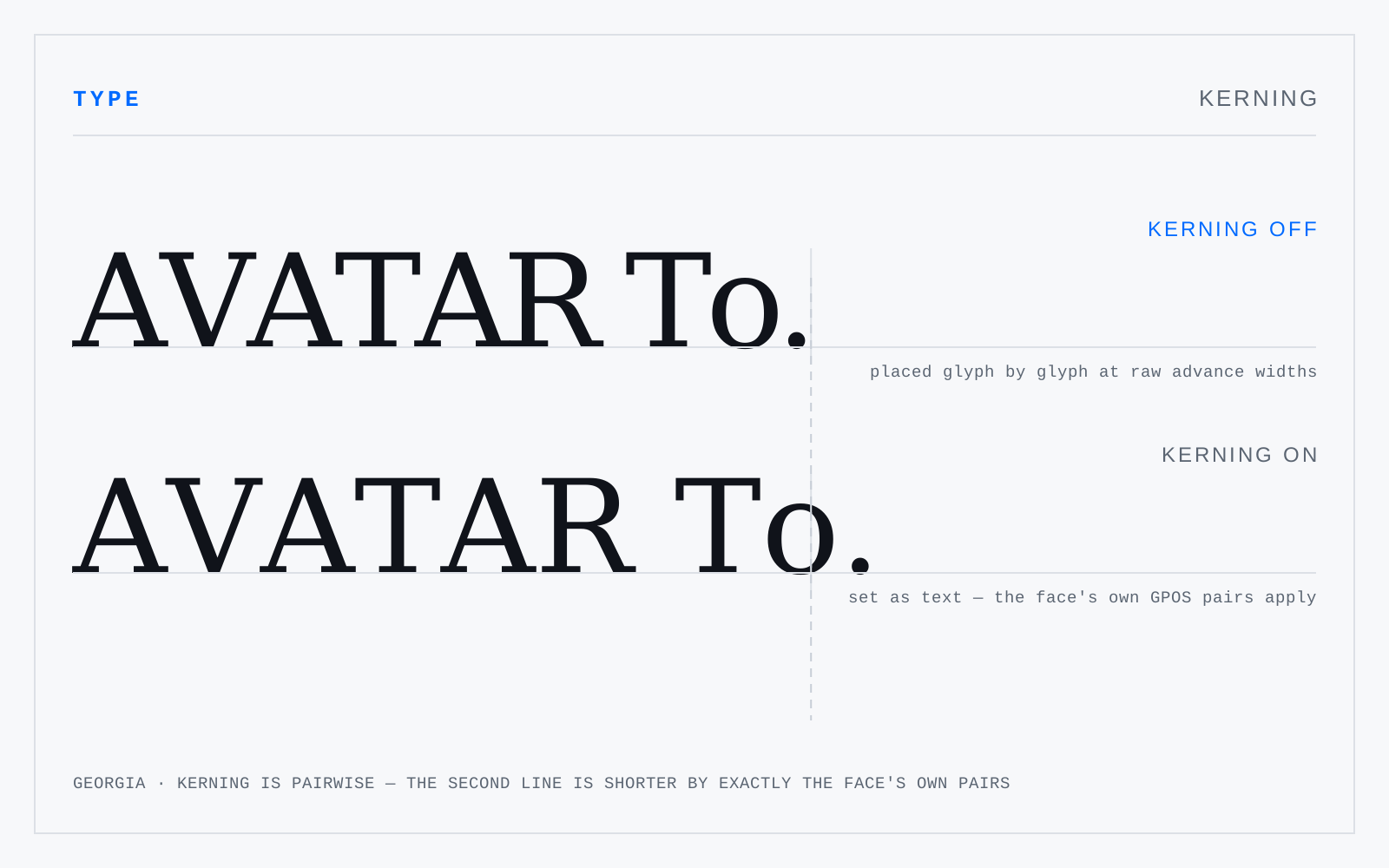
In practice
The single most abused word in the vocabulary. If you're changing the space across a whole run, that's tracking. Kerning is pairwise, and always pairwise.
Not to be confused with
- TrackingA uniform adjustment to the space after every glyph in a run — CSS letter-spacing. Size-dependent: display type usually wants negative tracking because the sidebearings were fitted for text, while small caps, all-caps runs and small labels want positive. Body text at text size almost never wants any.
- SidebearingThe space built into a glyph on either side of its outline. Left sidebearing plus the outline's width plus right sidebearing gives the advance width — how far the pen moves before the next glyph. Sidebearings are the font's own spacing; kerning is the per-pair correction applied on top of them.
Origin
From the kern of metal type: the part of a letter overhanging its own body onto the neighbour's. Kerned sorts were fragile, so kerning was rationed.