Design Nomenclature / Type
Tracking
Also called letterspacing, letter spacing, letter-spacing
- Type
- 2D
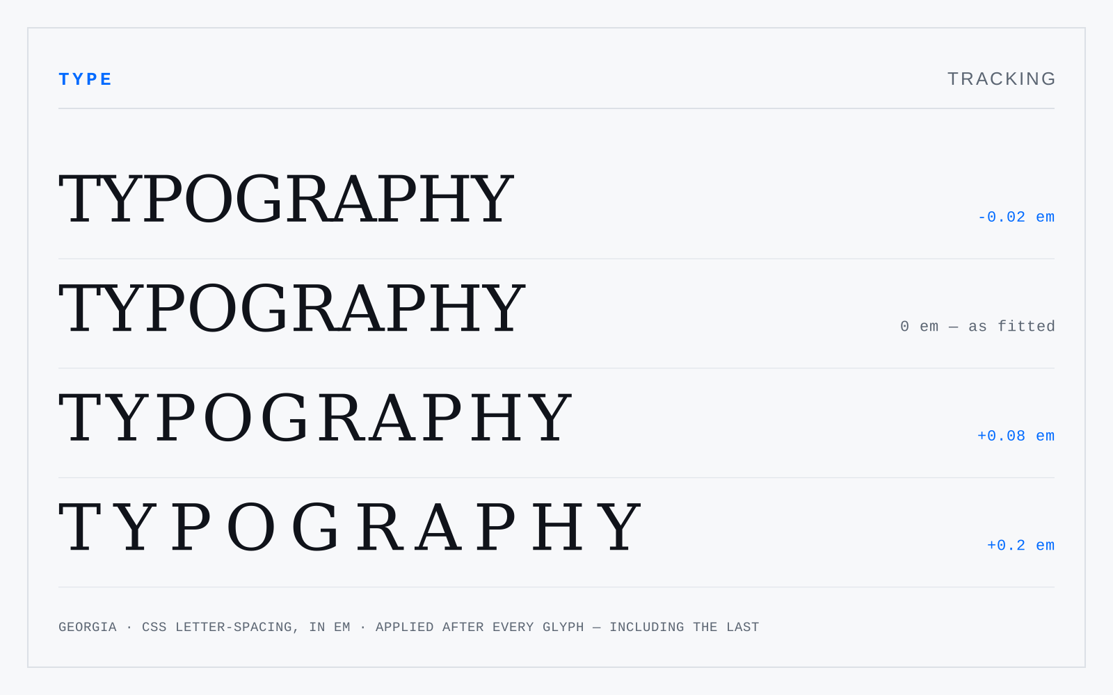
A uniform adjustment to the space after every glyph in a run — CSS letter-spacing. Size-dependent: display type usually wants negative tracking because the sidebearings were fitted for text, while small caps, all-caps runs and small labels want positive. Body text at text size almost never wants any.
In practice
Everyone calls this kerning. It isn't. Also note CSS adds the value after every character including the last, which is why tracked-out headings need a compensating negative margin.
Not to be confused with
- KerningAdjusting the space between one specific pair of glyphs, correcting fits the sidebearings can't get right on their own — AV, To, r. — because the correction depends on the neighbour. Fonts ship kern pairs in the GPOS table; browsers apply them by default at text sizes.
- Word spacingThe space between words, set by the font's space glyph and adjustable via CSS word-spacing. It should be the smallest space that reliably separates words — roughly a quarter of an em in text faces. Too wide and it rivals the line space, breaking the line into islands and opening rivers in justified setting.