Design Nomenclature / Type
Word spacing
Also called word space, interword spacing
- Type
- 2D
The space between words, set by the font's space glyph and adjustable via CSS word-spacing. It should be the smallest space that reliably separates words — roughly a quarter of an em in text faces. Too wide and it rivals the line space, breaking the line into islands and opening rivers in justified setting.
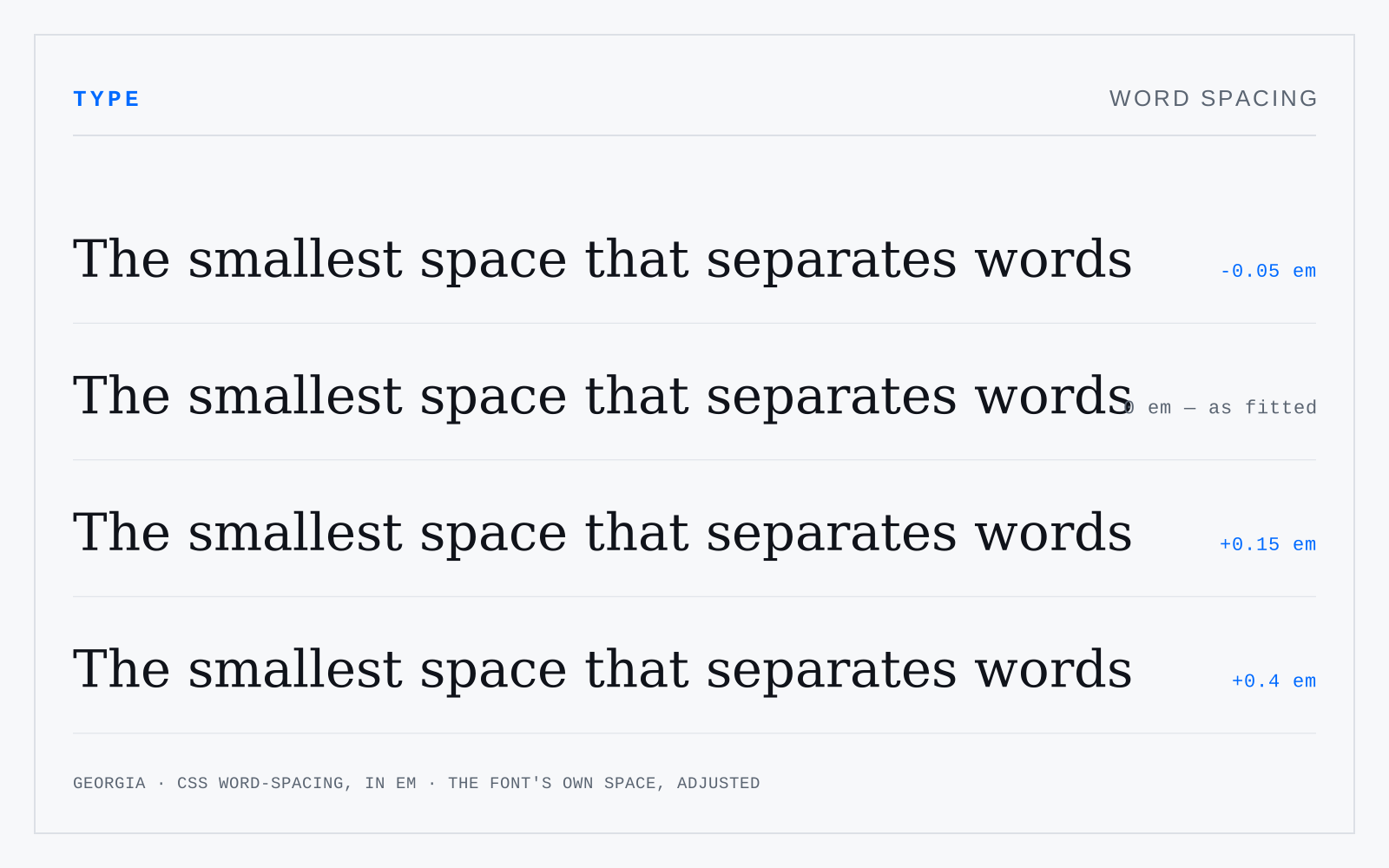
In practice
Word spacing is the variable justification eats first. When justified text goes gappy, that is word spacing being stretched past its tolerance, not a hyphenation problem per se.
Not to be confused with
- TrackingA uniform adjustment to the space after every glyph in a run — CSS letter-spacing. Size-dependent: display type usually wants negative tracking because the sidebearings were fitted for text, while small caps, all-caps runs and small labels want positive. Body text at text size almost never wants any.
- LeadingThe vertical distance from one baseline to the next. It is set against measure, not in isolation: a long line needs more of it for the eye to find the next line's start, a short line needs less. Under-leaded text merges lines; over-leaded text dissolves the paragraph into stripes.