№ 004Journal
Writing.
Thinking about design, development, typography, and the craft of building for the web.
A Field Kit in PETG
Eighty-odd printed parts hold a flying magnetometer together: clamps, cradles, couplers, and a towed sensor pod, all printed overnight on a desktop machine. Notes on 3D printing as a field-engineering practice, revision by revision.
Designing for an Invisible Constraint
A drone that measures magnetic fields cannot be built like other drones: every screw is a design decision. What a survey aircraft taught me about constraint-first design — a lesson twenty years of typography had already tried to teach.
The Agent in the Workshop
I gave Claude three specialized subagents — a mount designer, an OpenSCAD author, and a print checker — and let them iterate real drone parts through eighteen logged revisions. Notes on what AI-assisted mechanical design actually looks like.
The Performance Budget of a Typeface
If the brand face earns its place, make it cheap: one variable file instead of four statics, ruthless subsetting, honest font-display, and a fallback engineered so the swap is invisible. Font loading as an engineering discipline.
The Stack Under the Vibes
Vibe coding works — I've shipped a portfolio, AI platforms, and drone hardware this way. But it only works because three unfashionable tools hold it up: git for undo, GitHub for memory, and a plain Linux box you can actually reason about.
The Zero-Kilobyte Font Stack
The fastest webfont is the one you don't ship. When system font stacks are the right typographic decision for high-performance applications, how to build one well in 2026 — and when the brand face still earns its bytes.
Choosing Type for Data-Dense Interfaces
Dashboards, terminals, and monitoring screens ask different questions of a typeface than prose does: do the digits hold columns, can you tell 0 from O at 11 pixels, does the bold survive a dark theme? A selection checklist for interfaces under pressure.
On Typography and the Web
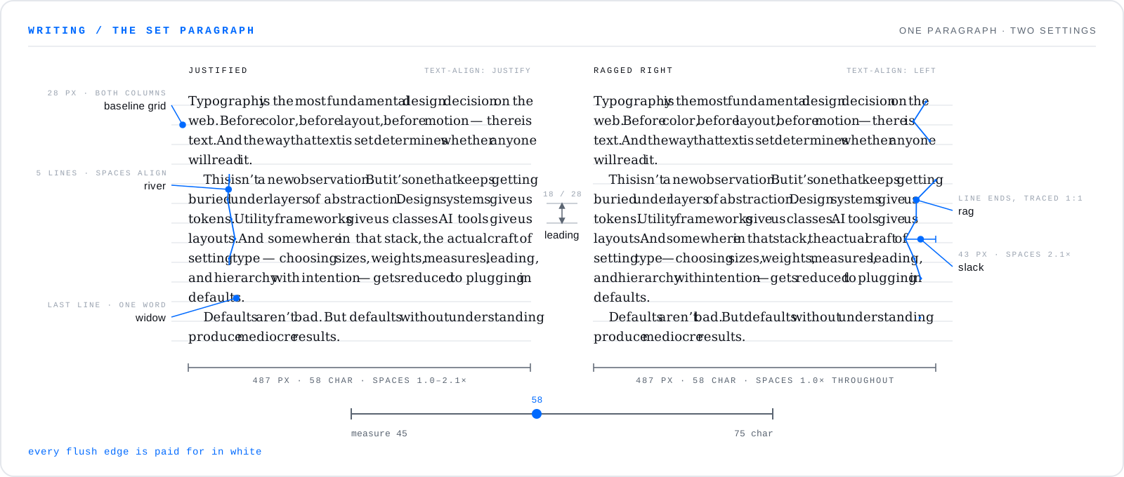
Why typographic craft still matters in an era of design systems, utility classes, and AI-generated layouts.
Building for Longevity
Thoughts on choosing technologies and architectures that age well, and why simplicity compounds.